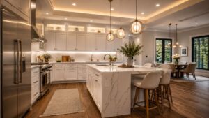
In Arlington, MA, a lot of homeowners call us when they're stuck in the middle ground between a full tile backsplash install and doing nothing at all. They want the kitchen to feel finished, cleaner, and more current, but they don't always want the mess, cost, or permanence of tile right away. That's exactly where painted backsplash work can make sense.
A painted backsplash can look sharp, especially in older Greater Boston homes where the kitchen already has good bones and just needs a practical visual upgrade. But this is one of those projects where prep matters more than paint color. In our experience as a Massachusetts licensed general contractor, the difference between a backsplash that wipes clean and one that starts looking tired fast comes down to surface cleaning, primer choice, finish selection, heat exposure, and how honest you are about the way you cook.
Paint also sits in the shadow of tile for a reason. Ceramic tile was selected by 34% of U.S. homeowners installing or planning a new kitchen backsplash in 2024 and 2025, well ahead of glass at 7%, marble at 6%, granite at 4%, and zellige at 4%, according to Statista's kitchen backsplash materials survey. That's why many painted backsplash projects are really about getting a tile-like finished look on a tighter budget or on a shorter timeline.
Table of Contents
- 1. Soft Neutral Backsplash Paint with Matte Finish
- 2. Bold Jewel-Tone Accent Backsplash
- 3. Warm Sage Green Backsplash for Natural, Organic Feel
- 4. Classic White or Cream Backsplash with Textured Paint Finish
- 5. Warm Terracotta or Rust-Inspired Backsplash for Mediterranean Flair
- 6. Dramatic Black or Charcoal Backsplash for Modern Contrast
- 7. Soft Blush or Warm Gray Backsplash for Modern Feminine Elegance
- 8. Two-Tone or Color-Blocked Backsplash for Visual Interest and Design Play
- Kitchen Backsplash Paint: 8-Option Comparison
- Ready to Plan Your Greater Boston Kitchen Remodel?
1. Soft Neutral Backsplash Paint with Matte Finish
Soft neutral backsplash paint is still one of the safest and strongest kitchen backsplash paint ideas for Greater Boston homes. In Cambridge, Newton, and Belmont, we see warm greige, soft taupe, and light cream work especially well with painted shaker cabinets, older wood floors, and mixed metal hardware. These colors don't fight the rest of the kitchen, which matters in homes where you're blending old trim details with new counters and appliances.
Matte or low-luster eggshell is useful when the wall isn't perfect. It hides minor surface flaws better than shinier finishes, and in many older kitchens that's a real advantage.
Why neutrals work in Cambridge and Newton kitchens
A Cambridge kitchen renovation might pair a soft greige backsplash with white shaker cabinets and marble counters. In a Medford addition, warm taupe often works better with natural oak and black pendants because it keeps the space from looking too flat. In a Newton remodel with stainless appliances and open shelving, cream can warm up an otherwise cool palette.
We tell homeowners to test boards in morning light and again at night. Boston-area kitchens can shift hard from gray daylight to warm artificial light, and a neutral that looks calm at noon can turn muddy after dinner.
- Use kitchen-rated products: Choose a paint system meant to handle moisture and grease, not standard wall paint from a leftover bedroom can.
- Keep trim shinier than the backsplash: Semi-gloss trim against a matte backsplash gives you contrast without adding visual clutter.
- Think about flexibility: If you want a lower-commitment design direction first, our guide to DIY kitchen backsplash ideas can help you compare paint with other light-refresh options.
Practical rule: The more movement you already have in your countertop, the calmer your backsplash color should be.
One more trade-off. Matte looks better on imperfect walls, but it's not what we choose directly behind a heavy-use cooking zone unless the client has strong ventilation and realistic expectations about touch-up work.
2. Bold Jewel-Tone Accent Backsplash
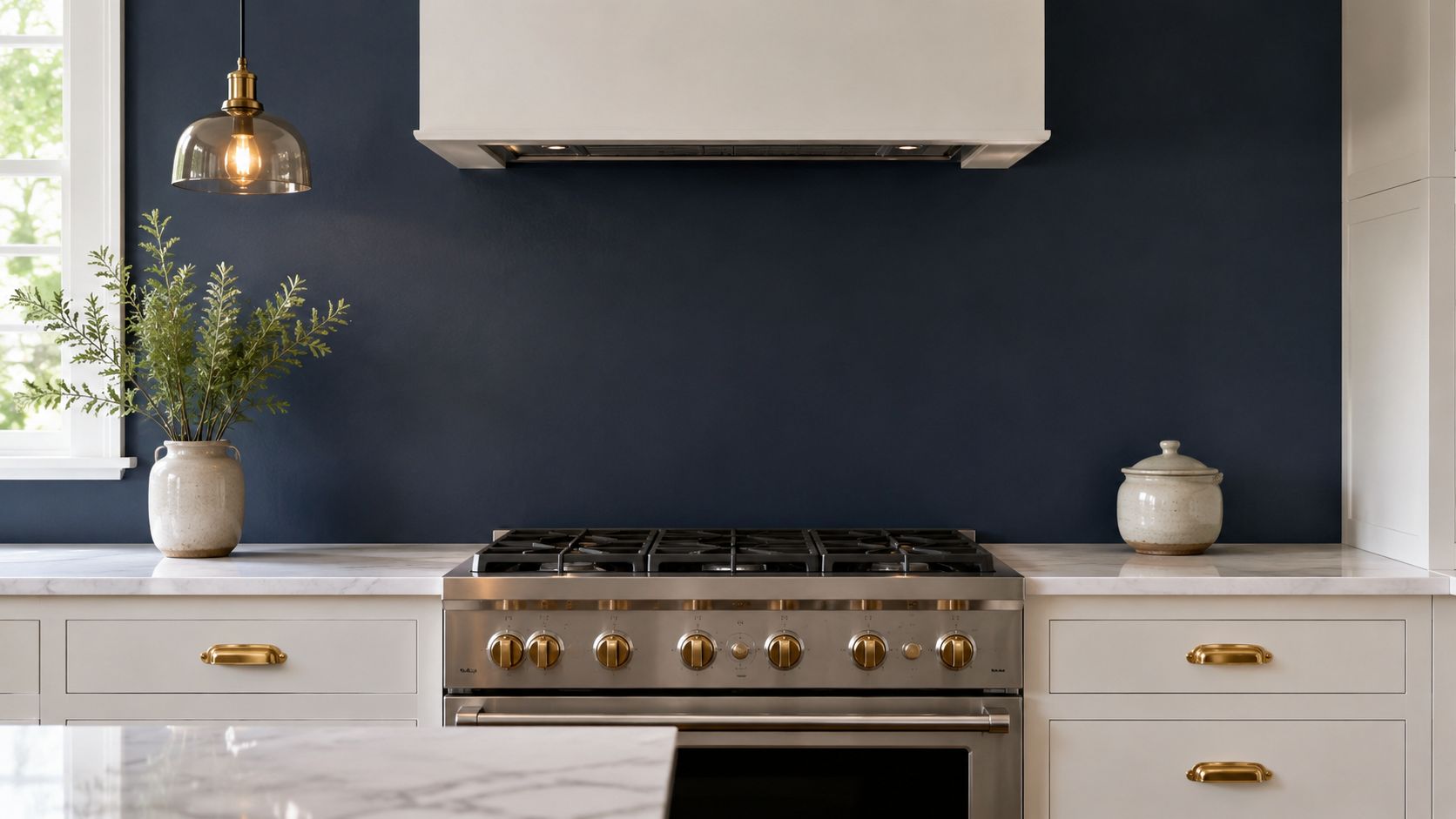
Deep blue, emerald, and rich navy can look excellent in the right kitchen. We like this move when the cabinets are white, off-white, or light wood and the homeowner wants one strong focal point without installing statement tile. In Brookline and Arlington, this style often lands well in kitchens that already have brass hardware, warmer light bulbs, and simple countertops.
The mistake is overcommitting. A jewel-tone painted backsplash can add depth, but if you wrap too much wall area in dark saturated color, the kitchen can feel tighter than it is.
How to keep deep color from taking over the room
A Brookline remodel might use navy with white marble and brass pulls. In Belmont, deep teal can work with light gray cabinetry and stainless appliances if the backsplash stays visually contained between the counter and upper cabinets. In an Arlington renovation, emerald behind open shelving can be striking, but only if the shelf styling stays restrained.
Warm lighting matters more than people think. We prefer a warmer lamp color in kitchens with navy or green paint because it keeps the finish from reading cold.
Rich color belongs on a surface with boundaries. A hood, shelves, or cabinet runs help frame it.
For product performance, we lean toward satin or semi-gloss in splash areas. That finish gives you a little more washability, and it reflects enough light to stop the color from going dead. If the range throws a lot of grease and heat, we'd rather use paint on side runs and use a more durable material directly behind the cooktop.
There's also a market reason painted alternatives keep coming up. The kitchen backsplash market is valued at $4.2 billion in 2025 and is projected to reach $6.8 billion by 2034, with a projected 5.8% CAGR during 2026 to 2034 according to Market Intelo's kitchen backsplash market report. Homeowners want durability and a personalized look. Paint can deliver the second part well, but you have to be realistic about the first.
3. Warm Sage Green Backsplash for Natural, Organic Feel
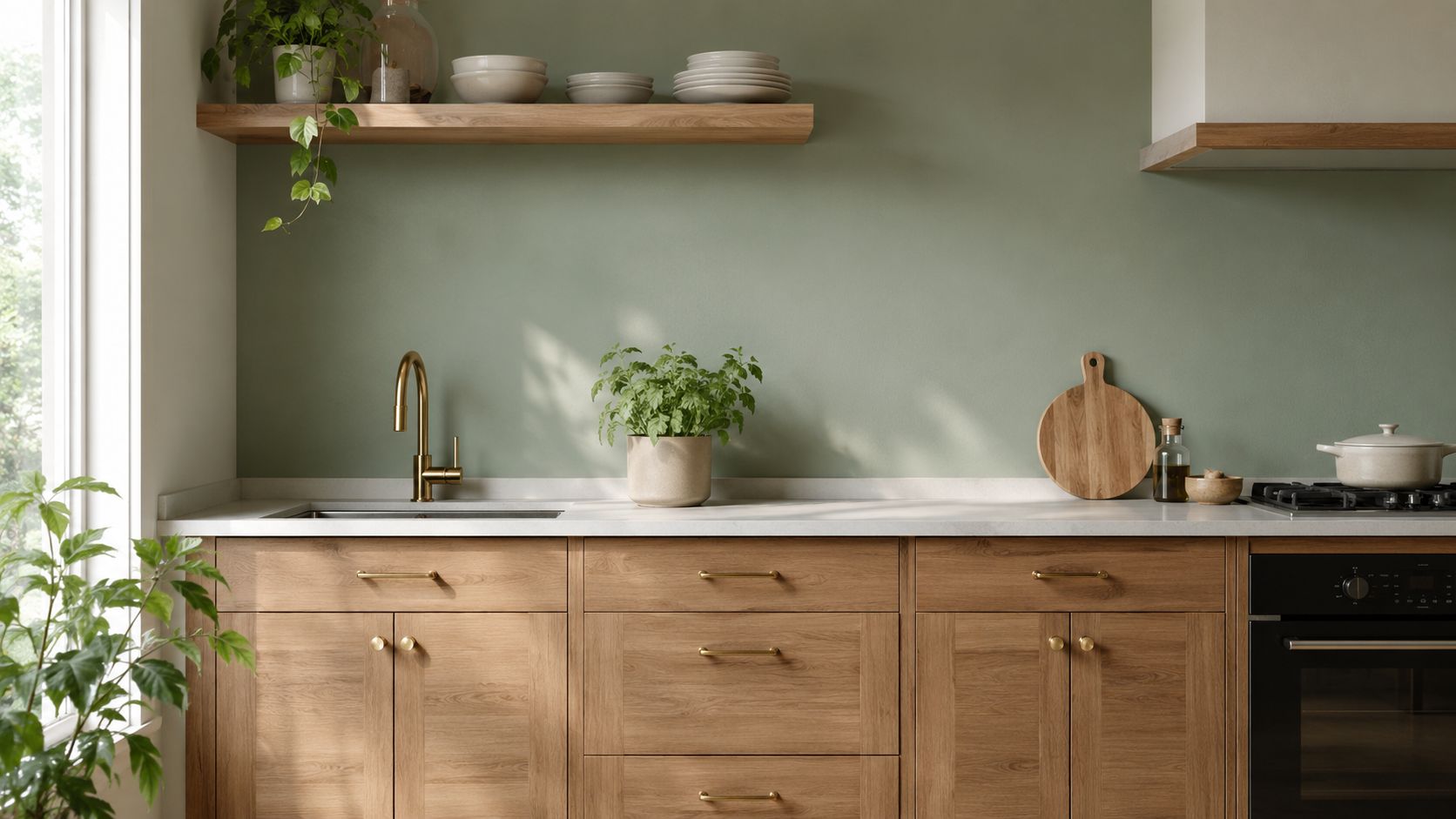
Sage green has staying power because it feels softer than a true statement color but more intentional than beige. In Lexington, Reading, and Wellesley, it works especially well in kitchens with natural oak, walnut accents, or open shelves. It gives the room some color without pushing it into trend-chasing territory.
This is one of the few painted backsplash directions that can bridge traditional and modern nicely. It can sit next to brass, copper, black hardware, or white quartz without looking confused.
Where sage works best in Greater Boston homes
A Lexington kitchen remodel might use soft sage against white oak cabinetry and brass knobs. In a Reading addition, dusty eucalyptus can work with a small herb shelf and a simple white counter. In a Medford whole-home renovation, we'd often keep the green muted and use white trim or shelf brackets to break up the wall.
A key caution is visual density. There's an underserved design gap around how painted backspashes interact with busy counters and decor in smaller kitchens, especially where homeowners underestimate how quickly a room can feel cluttered, as discussed in this design-gap review on backsplash and countertop balance. In practical terms, if you have a lively granite or quartz pattern, a quiet sage usually works better than anything too gray or too yellow.
- Pair with warm materials: Oak, walnut, brass, and copper keep sage from feeling chilly.
- Use a wipeable finish: Satin is usually the best middle ground for look and cleanability.
- Break up large painted fields: White shelving, trim, or a short tile return can keep the wall from looking flat.
We also recommend full sample boards, not tiny chips. Green is notorious for shifting under under-cabinet LEDs.
4. Classic White or Cream Backsplash with Textured Paint Finish
White or cream still works. The problem is that flat painted white behind a counter can look unfinished if the surrounding materials are also pale. That's why a textured paint approach, even a subtle one, can help. It adds depth without forcing color into a kitchen that's meant to stay quiet.
In Arlington, Stoneham, and Wakefield, this approach often fits homes where the cabinetry or island already carries the visual weight. A textured off-white backsplash can support the room instead of trying to lead it.
What to expect from painted texture in a real kitchen
An Arlington renovation with dark blue cabinets and marble tops can handle an off-white textured backsplash because the contrast is already there. In Stoneham, cream with light wood cabinets and brass looks warmer and less stark than bright white. In Wakefield, a soft textured white can work with a two-tone kitchen if the counters stay simple.
What homeowners need to know is that painted texture is not a shortcut for bad prep. If the wall has loose patches, grease residue, or uneven repairs, texture usually highlights that problem rather than hiding it.
Textured paint should create depth, not camouflage poor substrate work.
We like satin or semi-gloss here because white backsplash areas show splatter and hand marks quickly. Good ventilation matters too. HGTV's backsplash painting guidance notes that proper prep includes cleaning with soap, water, and rubbing alcohol, then using primer, at least two coats of latex paint with a minimum two-hour drying interval between coats, and finishing with polyurethane sealer for added protection in the kitchen environment, as outlined in HGTV's kitchen backsplash painting steps.
That system is more work than most DIY videos make it seem, but it's the difference between a quick makeover and a finish that holds up better.
5. Warm Terracotta or Rust-Inspired Backsplash for Mediterranean Flair
Terracotta, burnt sienna, and rust-inspired tones can be beautiful in the right house. We don't suggest them everywhere, but in Belmont, Newton, and Wellesley they can make sense when the kitchen already has warm wood, plaster-like walls, or a more old-world design language. These tones bring warmth fast, which is useful in spaces that feel cold or too gray.
They also read differently over the course of the day. Morning light can flatten them. Late afternoon and evening light usually make them look better.
Balancing warmth with Boston-area light conditions
A Belmont kitchen remodel with dark wood cabinetry and copper hardware can carry warm terracotta well. In a Newton addition, a rust-toned accent section can warm up walnut cabinets and brass lights. In Wellesley, burnt sienna can work with open shelves and cream walls if the rest of the palette stays edited.
The danger is heaviness. If you combine warm clay paint with patterned counters, dark floors, and busy shelving, the kitchen starts feeling crowded.
- Test in sunset light: These colors change noticeably as daylight gets warmer.
- Balance with lighter elements: Cream trim, pale counters, or open shelving keeps the room from getting too dense.
- Use a finish you can clean: Satin or semi-gloss is easier to maintain than flat paint in food-prep areas.
This is also where faux tile ideas can work. Industry guidance notes that homeowners who like the look of tile but prefer paint can create faux tiles by painting tile and grout one uniform color for a cleaner, cohesive result, discussed in this kitchen backsplash trend overview. We've seen that approach make sense when a homeowner wants the presence of a tiled wall without opening up a larger renovation.
6. Dramatic Black or Charcoal Backsplash for Modern Contrast
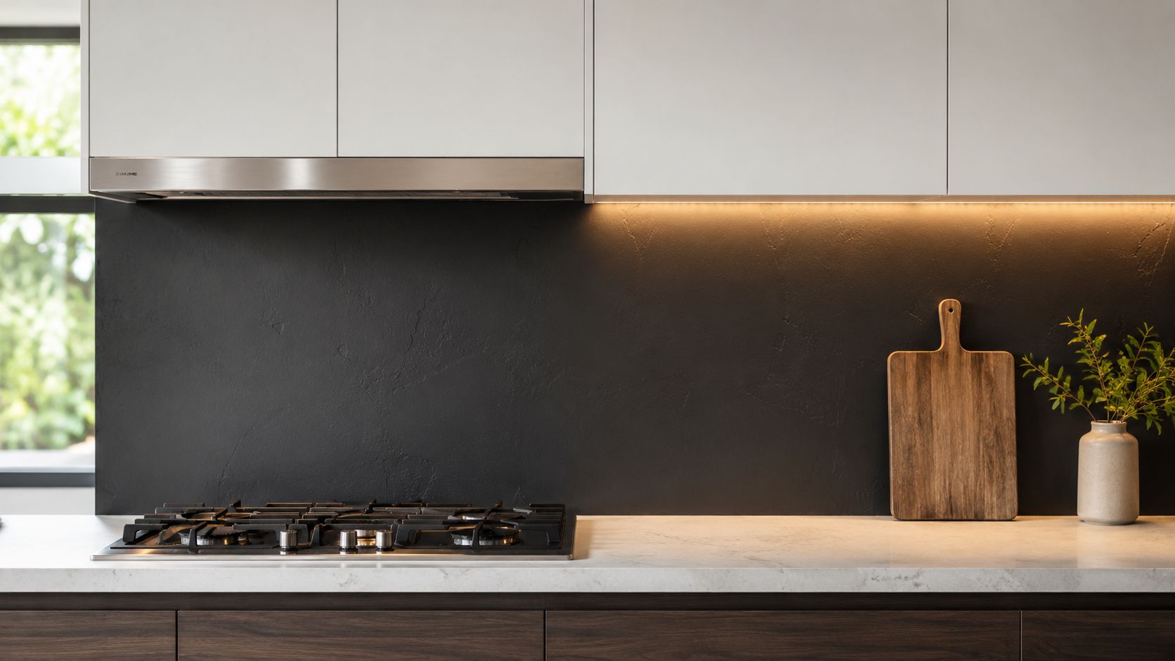
Black and charcoal painted backsplashes can look sharp, but they're less forgiving than people expect. They show dust, wipe marks, and dried splatter differently than white does. Instead of hiding mess, they often change the kind of mess you notice.
Still, in the right modern kitchen, this can be one of the strongest kitchen backsplash paint ideas on the list. We like it in Cambridge loft-style remodels, Medford modern kitchens, and Lexington additions where the cabinets, counters, and lighting already support a cleaner contemporary look.
What works and what doesn't with dark painted backsplashes
Charcoal behind white cabinetry and stainless appliances is usually easier to manage than true black. In a Medford remodel with skylights and light wood cabinets, black can work because the room has enough natural light to offset it. In Lexington, gunmetal with white trim details can feel more architectural than flat black.
Where it fails is in dim kitchens with busy stone counters and weak task lighting. The backsplash disappears, the splatter stands out, and the whole wall starts looking dull.
Dark paint needs strong under-cabinet lighting and a range hood that actually captures grease.
We also steer clients toward satin or semi-gloss here. It helps with cleaning and adds just enough reflectivity. If your cabinets are already dark, we'd usually point you toward a different approach or suggest reviewing backsplash ideas with dark cabinets before locking in a paint choice.
One more honest caveat. There's a major information gap on long-term painted backsplash failure rates in high-heat, high-grease zones behind stoves, with much of the current advice remaining anecdotal rather than evidence-based, as noted in this review of painted backsplash durability questions. That's why we're cautious about recommending paint directly behind serious cooking setups.
7. Soft Blush or Warm Gray Backsplash for Modern Feminine Elegance
Soft blush and warm gray-pink tones can look refined when the rest of the kitchen is disciplined. Done well, they feel quiet and custom. Done poorly, they look like a color mistake. We use these shades more often in Brookline, Newton, and Wellesley than in more rustic or heavily traditional kitchens.
This palette usually works best when you want softness without resorting to plain white. It pairs well with marble-look counters, brushed brass, and pale oak.
How we keep subtle colors from reading muddy
A Brookline kitchen renovation might use a soft blush backsplash with white cabinetry and brass hardware. In Wellesley, a warm gray-pink can support a modern farmhouse look if the island, pendants, and stools are simple. In Newton, a taupe-pink painted backsplash can add personality without turning the room into a themed space.
The biggest challenge is undertone. If the cabinet paint leans cool and the backsplash leans warm, the mismatch shows right away.
- Test next to fixed materials: Hold your sample against cabinet doors, countertops, and backsplash outlets.
- Use warm lighting: Subtle colors often die under harsh cool LEDs.
- Don't crowd the palette: Let hardware, art, or plants add contrast instead of layering more competing pastel tones.
This is also where style direction matters. If the kitchen is moving toward a cleaner updated feel, our modern transitional kitchen ideas often overlap well with blush, taupe, and warm gray backsplash choices.
A painted backsplash in this family can feel expensive if the room is edited. It won't if every finish in the kitchen is trying to say something at once.
8. Two-Tone or Color-Blocked Backsplash for Visual Interest and Design Play
Two-tone paint can work better than a single bold color because it gives the eye a break. We like it in more contemporary kitchens in Arlington, Somerville, and Wellesley, especially where the wall shape or cabinet layout naturally creates a clean division. It's one of the few decorative paint ideas that can feel intentional without pretending to be tile.
The key is geometry. If the split point is random or slightly off, the whole backsplash looks amateur.
A practical layout approach before you paint
In an Arlington remodel, a soft sage lower section with white above can help ground the counter area while keeping the upper wall light. In Somerville, a vertical navy-and-cream split can work if a hood or shelving unit gives the division a reason to exist. In Wellesley, two muted horizontal bands can look good in a clean, modern kitchen with minimal upper cabinetry.
Before painting, we map the visual lines first. Counter height, shelf height, the bottom of a window trim, and hood edges all matter more than the colors themselves.
For inspiration, this kind of graphic layout is easier to understand visually than in photos alone:
- Limit the palette: Two colors is usually enough.
- Use the same finish on both colors: Mixed sheen levels tend to look accidental.
- Lay out with a laser level: Painter's tape only works if the reference lines are right.
From a contractor standpoint, this approach is less about artistic freedom and more about discipline. Clean lines, controlled color, and a reason for the split are what make it work.
Kitchen Backsplash Paint: 8-Option Comparison
| Style | Complexity 🔄 | Resources ⚡ | Expected Outcomes 📊 | Ideal Use Cases 💡 | Key Advantages ⭐ |
|---|---|---|---|---|---|
| Soft Neutral Backsplash Paint with Matte Finish | Low–Medium, basic prep and paint; easy touch-ups | Low, matte/eggshell paint, primer, basic tools | Subtle, timeless backdrop; hides minor imperfections | Traditional, farmhouse, transitional kitchens (Greater Boston) | Timeless; forgiving finish; versatile with cabinetry |
| Bold Jewel-Tone Accent Backsplash (Deep Blue, Emerald, or Navy) | Medium, confident color choice; lighting considerations | Medium, high-quality satin/semi-gloss paint; possible hardware updates | High-impact focal point; luxury, elevated perceived value | Modern, contemporary, eclectic remodels; accent walls | Strong statement; adds personality; ages well |
| Warm Sage Green Backsplash for Natural, Organic Feel | Low–Medium, color matching recommended | Low–Medium, satin/semi-gloss paint; coordination with wood/brass | Calming, nature-inspired aesthetic; wellness-focused | Contemporary, farmhouse, wellness-focused kitchens | Brings nature indoors; complements wood and warm metals |
| Classic White or Cream Backsplash with Textured Paint Finish | Medium, texture techniques require skill | Low–Medium, specialty/texturing paints and tools | Bright, refined backdrop; adds subtle depth and reflects light | Transitional, minimalist, modern farmhouse kitchens | Truly timeless; maximizes light; highly versatile |
| Warm Terracotta or Rust-Inspired Backsplash for Mediterranean Flair | Low–Medium, test samples for warmth under different light | Low–Medium, satin/semi-gloss paint; warm-metal accents | Warm, artisanal Mediterranean character; cozy atmosphere | Rustic, Mediterranean, transitional kitchens | Authentic warmth; pairs well with wood and copper |
| Dramatic Black or Charcoal Backsplash for Modern Contrast | Medium, requires strong lighting and ventilation | Medium, satin/semi-gloss paint; upgraded ventilation/lighting | Dramatic, high-contrast anchor; hides splatter well | Modern, minimalist, industrial kitchens | High-impact, modern look; conceals stains; timelessly contemporary |
| Soft Blush or Warm Gray Backsplash for Modern Feminine Elegance | Low–Medium, careful shade selection is important | Low–Medium, satin/semi-gloss paint; quality lighting/hardware | Subtle, refined color interest; elegant and photographed well | Contemporary, modern farmhouse, transitional kitchens | Fresh, sophisticated, subtle color without overpowering |
| Two-Tone or Color-Blocked Backsplash for Visual Interest and Design Play | High, precise planning and tape work required | Medium, multiple paints, masking tools, more labor/time | Geometric definition and visual play; customizable impact | Design-forward, contemporary, open-concept kitchens | Flexible design; high visual interest; easy to refresh sections |
Ready to Plan Your Greater Boston Kitchen Remodel?
A painted backsplash can look sharp on day one and tired six months later if the rest of the kitchen is fighting it. We see that a lot in Greater Boston homes, especially in Newton, Arlington, and Brookline, where homeowners want a faster, lower-cost refresh but still expect the room to hold up like a full remodel. Paint can work. It just has to be the right choice for the wall, the cooking habits, and the budget.
From a permitting standpoint, backsplash paint is usually straightforward finish work. Under the 10th edition of the Massachusetts State Building Code, 780 CMR 105.2.2, painting, tiling, cabinets, countertops, and similar finish work are generally exempt from permit requirements, as summarized in this Massachusetts State Building Code update. If the project also includes new wiring, plumbing changes, wall removal, or a new layout, permits and inspections usually come back into play, and we handle that coordination for homeowners across the Boston area.
Residential code also does not require a backsplash itself, as noted in this overview of backsplash code requirements. In practice, though, the wall behind a range or sink still needs a surface that cleans up well and does not break down under grease, moisture, and regular scrubbing.
That is a key decision point. Paint costs less up front and is faster to change. Tile holds up better in heavy-use kitchens, especially behind serious cooking zones. For a homeowner doing a lighter kitchen update in Somerville or Medford, painted backsplash areas can make sense around coffee stations, pantry walls, or lower-splash prep areas. For a family kitchen with frequent stovetop cooking, we often recommend tile, slab, or another harder finish where the wall takes daily abuse.
We look at the whole room before we recommend either path. Cabinet sheen, countertop pattern, under-cabinet lighting, venting, and even the amount of open storage all affect whether a painted backsplash reads intentional or starts to feel temporary.
At Aureli Construction, we build kitchens across Cambridge, Arlington, Belmont, Brighton, Brookline, Burlington, Lexington, Medford, Melrose, Newburyport, Newton, Reading, Somerville, Stoneham, Wakefield, and Wellesley. We help homeowners decide where paint is a smart cost-saving move, where tile is worth the extra labor, and when a modest refresh should turn into a full remodel. If you're planning a kitchen refresh or full remodel in Cambridge, Arlington, Belmont, Brookline, Newton, Somerville, Wellesley, or anywhere in Greater Boston, contact Aureli Construction for a free estimate. We handle design guidance, permitting, construction, and the practical decisions that make a kitchen look good and hold up.